
Los Angeles Times
Los Angeles Times
Los Angeles Times is a well-known regional news publication and it covers a wide range of topics. Its paper subscription is high but its digital subscription lacks in comparison. Something just doesn’t give on the LA Times website and mobile app. And given the continuing rise of the internet and the dominance of younger readers, this is a problem that must be resolved.
TYPE
In House Project
DURATION
6 Weeks (3 Sprint Cycles)
ROLE
Research | UX | UI
TEAM
1 PM, 2 Designers, 2 Developers
Narrow down the problem space
We didn't immediately start off with a clear problem space to target. We only had one clear goal, which was to bring more value to newsreaders through our digital platform. So we spoke with various readers to understand how they consumed news in general and interacted with our platform.
Unsurprisingly, we gathered a ton of varying insights. Some love the option to personalize news while some hate to be trapped in a filter bubble. Some only spend less than a minute on reading the article while some read from the first word to last. Some indulge in political news on all levels while some restrain from all that toxicity.
But all the insights can be boiled down to readers wanting to be informed on things that matter to them. And they want to achieve this with ease and full autonomy.
What data informed us
To further supplement our research, we looked into data analytics provided by the data team. A couple of points stood out to us:
- readers stayed on the Home feed more than any other section of the app
- highest converting topics were local politics/politicians before the Covid-19 pandemic and the Covid-19 tracker thereafter
- 35% of readers leave after reading just one article
From the assessment of our own product, we realized that the app lacked incentives for readers to explore other territories and we weren’t providing the useful content that they sought out on our website.
Tried and true solutions
It wasn’t enough to just self evaluate, given the vast amount of competitors that were receiving praises from our own audience base. So what were the distinctions between LA Times and other big names like NY Times, Washington Post, and USA Today? Well, evidently they all allowed personalization of news, packaging of articles, push of breaking information, and a beautiful interface that was also informative.
But we weren't here to copy, we wanted to see how well these solutions worked and if it's even applicable to Los Angeles Times.
Our Problem Statement
“Readers were having a tough time locating articles of interest and relevance.”
Target the problem and find feasible solutions
Targetting the problem, we proposed many promising and innovative solutions, such as implementing a reward system, shareable reading analytics, in-line submission of questions to reporters, just to name a few. But unfortunately, we had to take time constraints, technical feasibilities, and business objectives into consideration. Ultimately we wanted to find solutions that were high value yet low effort, as well as solutions that didn't rely heavily on the editorial side, given its herculean buy-in. In retrospect, I wished our team had pushed back on the editorial constraint because we realized readers cared most about content.
So we re-approached the problem and thought back to our interviews. Readers knew exactly what they were interested in. And we want to find a solution within their reading flow. This begs the question of how can we allow them to find the content they're interested in and discover important information within their typical reading flow?
In the current app, readers have no way to set their preferences. The only way readers can discover articles of interest was to rummage through the different sections or search keywords. Both methods are comparable to finding a needle in a haystack, especially given our faulty in-app search engine.
On the flip side, Los Angeles Times has published some incredibly useful content such as the wildfire tracker, Covid-19 tracker, and various food guides that readers often revisit on the website. Yet interestingly, LAT doesn't showcase this content on the app at all.
Realize the ideas & test them
We took the ideas to paper and sketched out the possible user flows for both foci: personalization and utility. The goal for the personalization feature is to allow readers to quickly access stories based on their reading habits (topics, reporters, newsletter) and in varying formats (text, video, podcast). And the goal for the utility feature is to introduce or update readers on information that are evergreen (food guides) and have high value in the current time and space (Covid tracker).
After a round of discussion and votes, we created 3 wireframes each for personalization and utility. We showed these to real LAT readers in the form of two separate tests. Separating the two foci allowed deeper analysis for each and it just made more sense given their separate placement within the app.
Feedbacks we received
Personalization
1. Readers liked the different modules that showcase stories under different formats and interest points. Although some questioned the order of the modules based on their level of interest.
2. Most readers also saw "My News" as a separate category from the Home feed, so it didn't make sense to them to have "My News" be a section rather than a tab.
3. Readers also liked the concept of packaged articles such as our "Daily 5" but had questions regarding the article selection method.
Utility
1. Readers valued having immediate access to the utility content but were not certain about the trigger affordance on some variations.
2. Although readers liked the easy point of access present on the home feed, they thought it was too small of a space for exploring the content.
Now we reiterate
So we went back to the drawing board, carefully picking through which feedback to implement. Much of the feedback was focused on the content, which is expected given the industry. So we really had to be conscious of which changes were justifiable and which were out of our control. The main objective of the iteration was to better showcase followed content in a fashion that made sense to readers and also allow them to discover and follow utility articles within reasonable space.
If it doesn't work, find another way
In our new round of testing, readers understood "My News" section much better but didn't like the horizontal scroll gesture and expand to see more options. They just wanted faster access to articles they're interested in. On the other hand, readers liked the introduction to utility articles but they didn't understand why they need to pin such content let alone finding this content in "My Library" when no action has been taken.
Pinning articles is a new concept for newsreaders, so there was no existing mental model to refer to. It was definitely a challenge for us to design something that readers had no experience with. Nonetheless, we were adamant about showcasing this content because they are useful to readers as according to our website data.
During group brainstorm, we hypothesized the confusion to be attributed to the isolation of the utility articles. So we scratched the entire design and came up with a new solution.
We integrated the utility content within "My News" section under the "Following" subsection. This was decided because pinning articles virtually means the readers want to save and follow the article. This change also allowed a new level of preference, following articles of interest. Readers have a catalog of utility articles to follow from as well as the option to follow any articles not listed in the catalog.
Hypothesis overturned & the final design
Our initial hypothesis of expecting readers to be proactive and pin useful articles was overturned.
We now realized that readers wouldn't complete a task (pinning articles) if they don't understand the value. Giving users too much freedom actually backfired in terms of providing utility. And without users actively pinning articles, the placement of utility content within the "Following" subsection no longer made sense.
Therefore we separated the utility articles based on topics and designed a module to be placed in the relevant sections. The module release and updates are to be decided by the editorial team.
Now readers can go about their reading flow and subsequently discover important notices like the wildfire preparation module. No need to pin articles, the heavy-lifting is all done on the back-end.
Additionally, we eliminated the need for readers to manually pin articles. In replacement, we select and showcase a few of the most important articles in the form of banners. The purpose is to allow readers to find these high utility articles easily and consistently.
RESULTS
Readers are now able to prioritize news that they care about and find articles from followed topics & reporters in a glance. They can also quickly access important information that is pertinent to their current situation and needs.
Selected Works

Enpower LA - 311 DataProject type
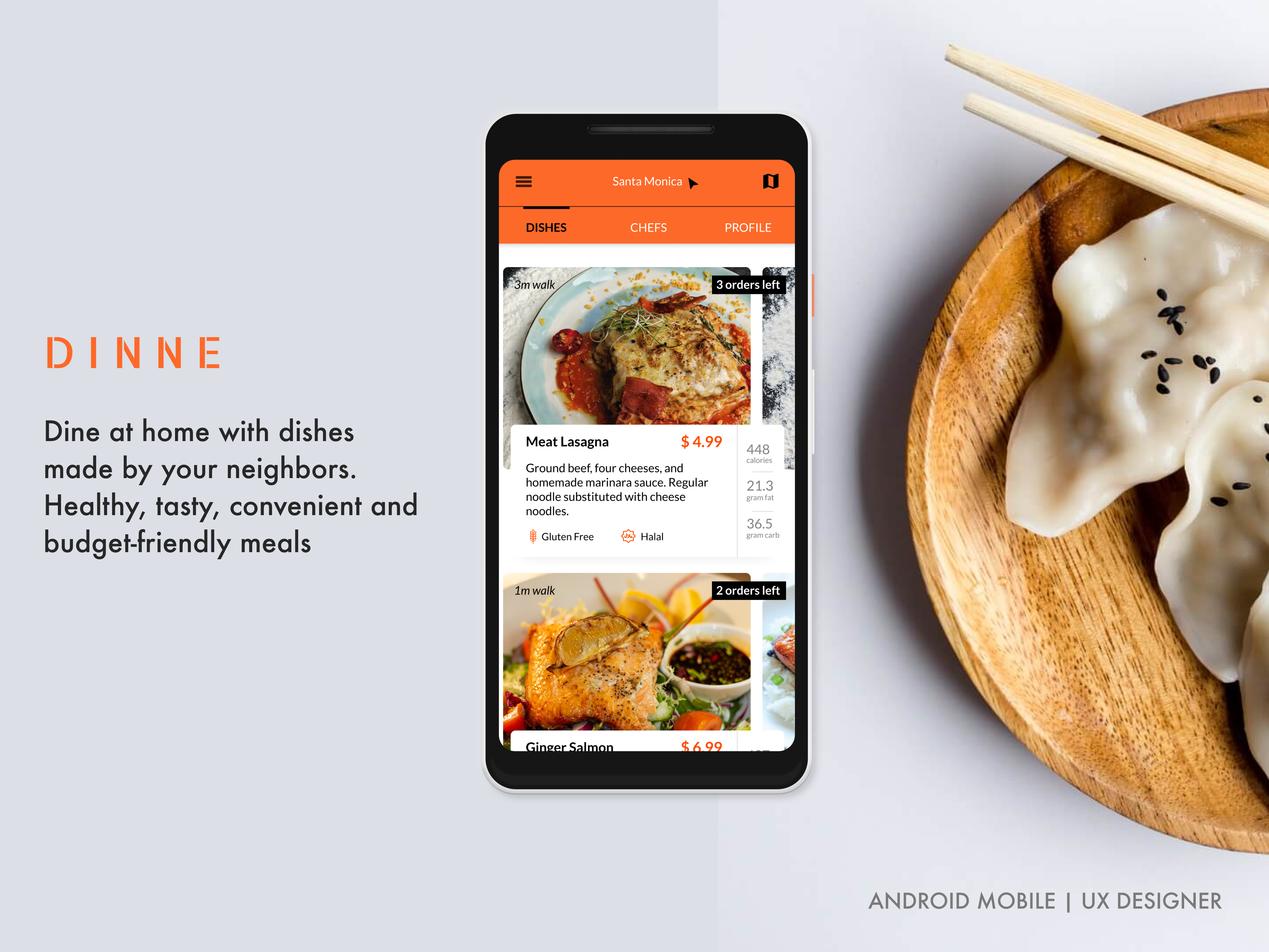
DINNEProject type
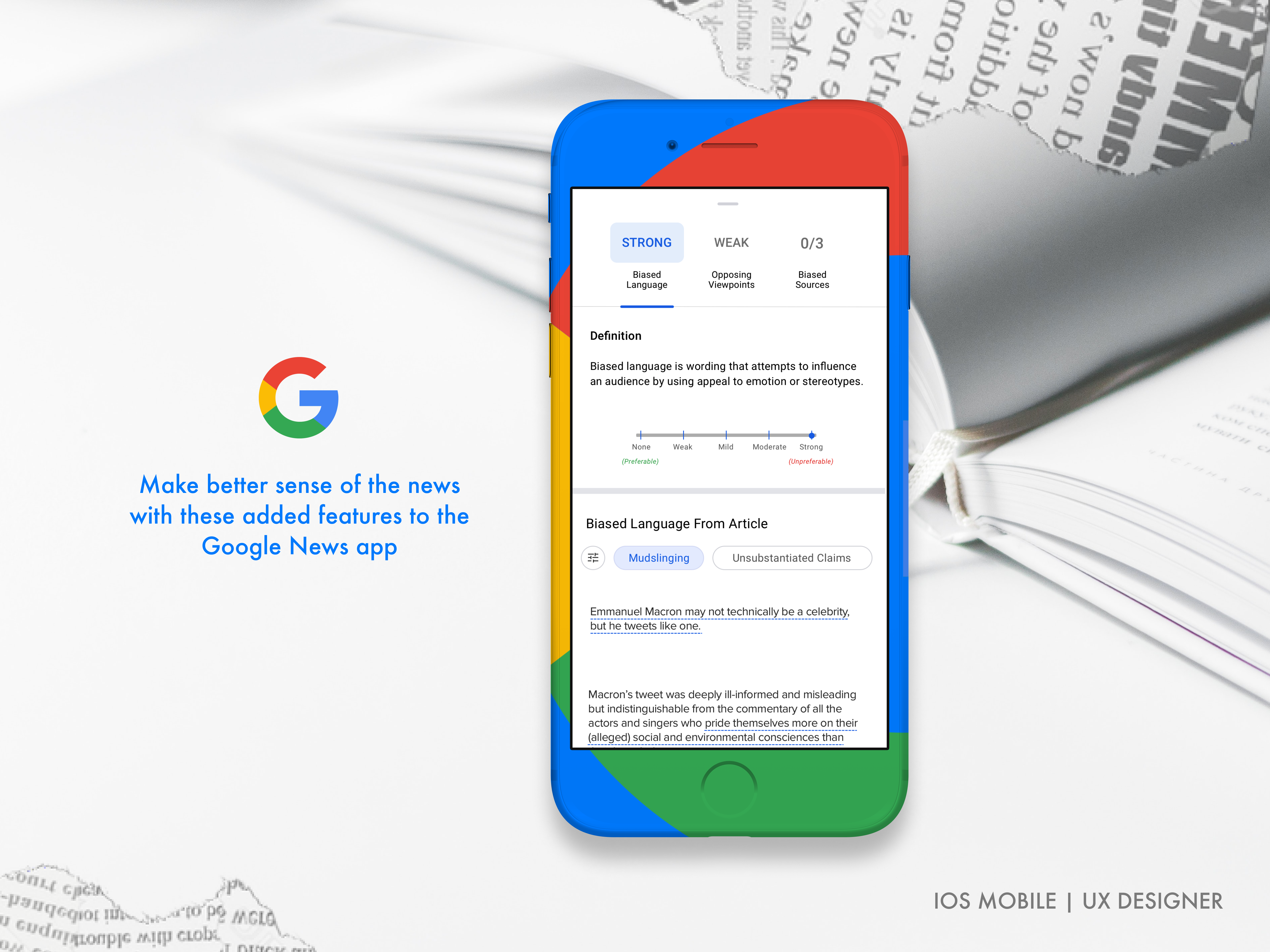
Google News DigestedProject type
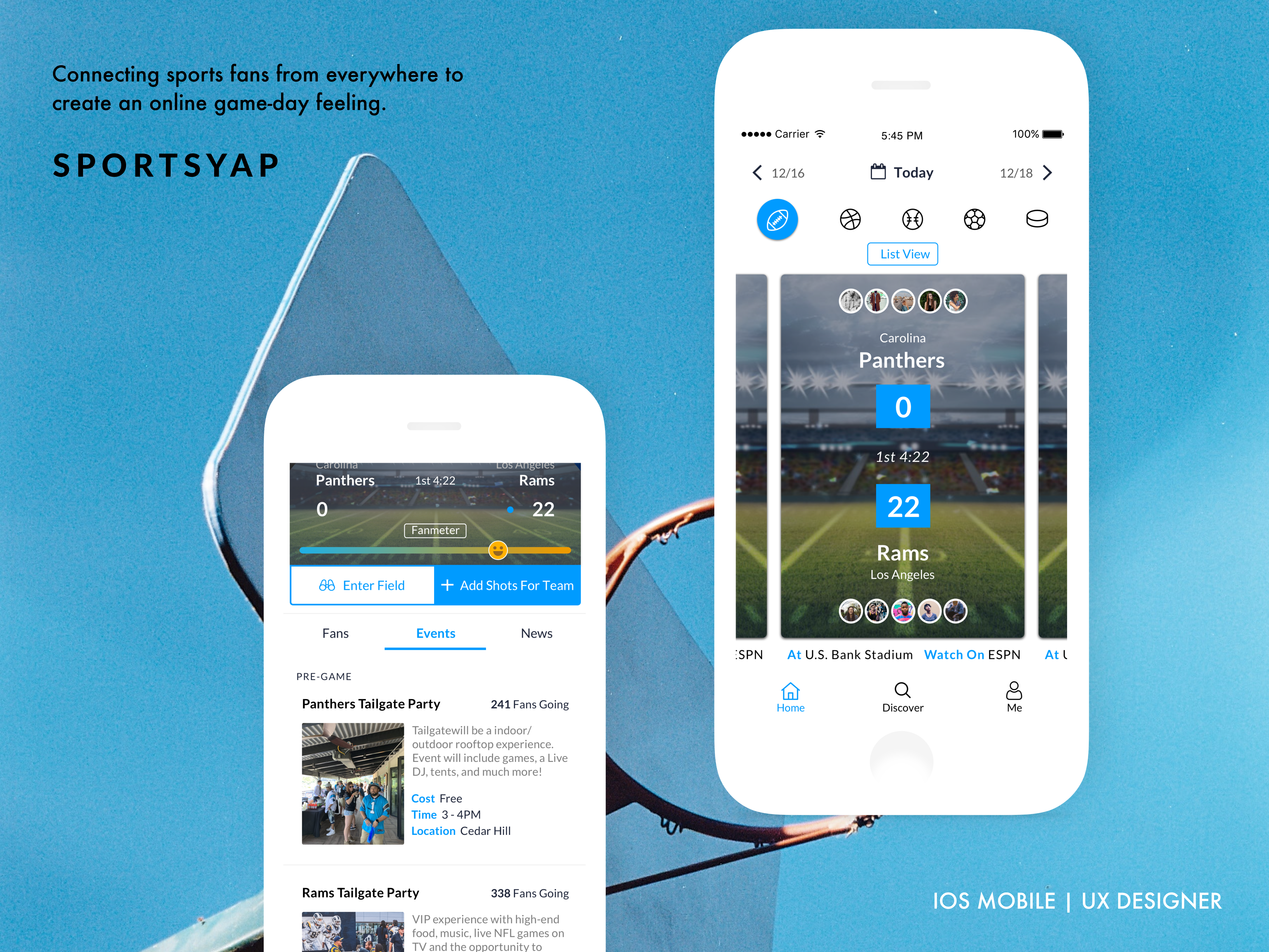
SportsyapClient Work